Comparing several stocks, sectors, or ETFs can become difficult when each asset has its own chart. A Relative Rotation Graph (RRG) provides a simpler way to view these relationships by putting multiple assets on one visual chart. If you are learning how to use a relative rotation graph, the most important thing is not simply memorizing what each quadrant means. You also need to understand how an asset moves, what it is being compared against, and whether that movement is supported by other market evidence.
This guide explains how to read an RRG, interpret its movement, compare assets, and use the information to build better market analysis.
What Is a Relative Rotation Graph?
A Relative Rotation Graph (RRG) is a visual analysis tool that helps traders and investors compare the performance and momentum of multiple assets against a benchmark. Instead of checking several charts separately, an RRG places different assets on one chart so you can quickly see which ones are performing strongly, losing momentum, recovering, or lagging.
An RRG can help you:
- Compare multiple assets against the same benchmark
- Identify market leaders with strong relative performance
- Spot weakening assets before their relative performance declines further
- Find improving assets that may be gaining momentum
- Track rotation as assets move between different market conditions
- Build a shortlist of assets that deserve deeper price-chart analysis
The key idea is that an RRG focuses on relative performance and momentum, rather than simply showing whether an asset's price is going up or down. This differs from technical analysis on leading vs lagging indicators, which focuses on how indicators respond to price movements.
What Does a Relative Rotation Graph Actually Show?
A Relative Rotation Graph compares assets against a selected benchmark using two key ideas: relative strength and momentum. Instead of asking only whether an asset's price is rising or falling, an RRG asks how that asset is performing compared with something else.
For example, if you compare several market sectors against a broad index, one sector could be rising faster than the benchmark while another is falling behind. The RRG makes these differences easier to see at the same time.
Relative Strength Is One Part to Understand
Relative strength shows how an asset is performing compared with its benchmark.
An important point is that an asset can increase in price while still showing weak relative performance. If the benchmark rises faster, the asset may technically be gaining but still losing ground compared with the market. This is an important concept when analyzing market structure.
This is why looking only at absolute price movement can sometimes hide important differences between assets.
Momentum Shows Whether Conditions Are Changing
Momentum adds another layer to the comparison.
Two assets might have similar relative strength, but one could be gaining momentum while the other is losing it. This helps explain why an RRG is more useful than a simple ranking of past performance.
The combination of relative strength and momentum creates the chart's four main quadrants.
How to Read the Four RRG Quadrants Without Misreading Them
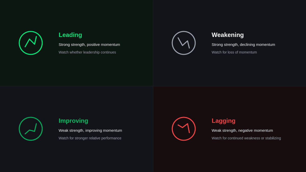
Understanding the four quadrants is essential for beginners learning to read an RRG. Each quadrant shows a different combination of relative strength and momentum, helping you understand an asset’s current position and direction.
| Quadrant | Relative Strength | Momentum | What to Watch |
|---|---|---|---|
| Leading | Strong | Positive | Whether leadership continues |
| Weakening | Strong | Declining | Loss of momentum |
| Lagging | Weak | Negative | Continued weakness or stabilization |
| Improving | Weak | Improving | Movement toward stronger relative performance |
The quadrants describe conditions rather than giving automatic trading instructions.
An asset in Leading is not automatically a buy, just as an asset in Lagging is not automatically a sell. The direction of movement and supporting evidence are important.
How to Use a Relative Rotation Graph Step by Step
The best way to understand an RRG is to use it as part of a repeatable analysis process. Here is a step by step guide to make you better understand how to use a relative rotation graph:
Step 1: Pick the Right Benchmark
Start with the benchmark that makes sense for your comparison.
If you are comparing broad market sectors, a major market index may be appropriate. If you are comparing companies from one industry, a sector benchmark could provide more useful context.
The benchmark matters because relative performance has no meaning without a reference point.
Step 2: Build a Relevant Comparison Group
Choose assets that make sense to compare with one another.
You could analyze:
- Technology stocks
- Market sectors
- ETFs
- Different asset classes
- Companies within the same industry
Putting unrelated assets together can make the chart harder to interpret. A focused comparison group gives the RRG a clearer purpose.
Step 3: Identify the Current Quadrant
Once the assets are displayed, check where each one is positioned.
Ask:
- Which assets are currently leading?
- Which ones are losing momentum?
- Which lagging assets are beginning to recover?
- Are several assets clustered in one area?
This gives you an initial picture of market leadership.
Step 4: Follow the Trail
The trail behind each asset is one of the most useful parts of an RRG.
A current position tells you where an asset is now. Its trail provides information about how it got there and where it may be heading.
For example, an asset moving from Improving toward Leading may deserve attention even though it is not yet among the strongest performers.
Likewise, a Leading asset moving toward Weakening could require closer monitoring because its momentum may be changing.
Step 5: Compare Assets With Each Other
Don't analyze every asset independently.
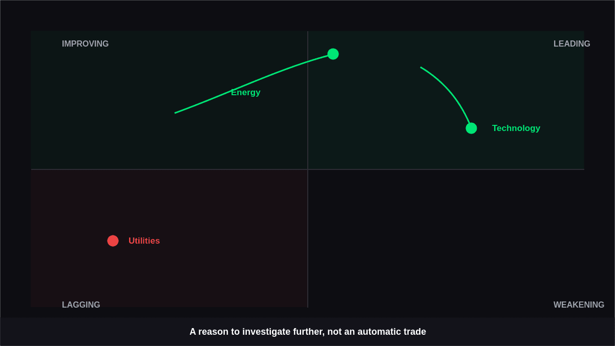
Suppose one sector is already in Leading while another is in Improving and moving quickly toward Leading. The second sector may be worth researching because its relative conditions are changing, which can support better entry exit signals.
This does not mean it will outperform. It simply gives you a reason to investigate further.
Step 6: Confirm the Finding on a Price Chart
An RRG should help you decide where to look, not make the entire decision for you.
After identifying an interesting asset, examine its traditional price chart. Look at its trend, support and resistance, volume, price structure, and other indicators that fit your strategy.
This extra step can help distinguish a meaningful change from temporary market noise.
How to Interpret RRG Movement and Rotation
Moving between quadrants can show important changes in an asset’s strength and momentum. It helps you spot shifts before they become obvious on a regular price chart.
By tracking the direction of movement, you can better understand whether an asset is improving, weakening, leading, or lagging.
Improving to Leading
This transition suggests that relative momentum and performance are strengthening. It can indicate that an asset is moving from recovery toward stronger market leadership.
Traders should still look for confirmation before treating the movement as a trading opportunity.
Leading to Weakening
An asset can remain relatively strong while its momentum starts to decline.
This is important because an asset doesn't have to become weak immediately. Weakening can represent an early change in conditions that deserves monitoring.
Weakening to Lagging
This movement indicates that both relative strength and momentum have deteriorated.
If the trail continues in this direction, the asset may be losing its position compared with the benchmark.
Lagging to Improving
This can represent an early recovery.
The asset is still relatively weak, but its momentum is beginning to improve. For investors searching for emerging opportunities, this transition can be worth investigating.
These movements should not be treated as a guaranteed cycle. Markets can change direction at any time.
A Practical RRG Example Using Market Sectors
Imagine a trader is comparing Technology, Financials, Energy, Healthcare, and Utilities against a broad market index.
Technology is currently in Leading but its trail is moving toward Weakening. Energy is in Improving and moving toward Leading. Utilities remain in Lagging with limited movement.
What should the trader do?
Not automatically buy Energy or sell Technology.
Instead, the RRG highlights areas that deserve deeper research. The trader could examine whether Energy's price trend supports its improving relative momentum. They could also check whether Technology is showing signs of a broader trend reversal using technical indicators.
This approach turns the RRG into a market-scanning tool rather than a mechanical trading system.
Using a Relative Strength Rotation Chart to Find Market Opportunities
A relative strength rotation chart can help traders organize a large group of assets and quickly identify areas that deserve attention.
For example, an investor could use an RRG to:
- Find established market leaders
- Monitor sectors losing momentum
- Identify assets beginning to recover
- Compare competing industries
- Build a shortlist for further research
The key is to view these findings as potential research opportunities.
An Improving asset may eventually become a leader, but it can also reverse direction. Similarly, a Leading asset may continue outperforming for much longer than expected.
RRG Chart Tutorial: What Should You Look at First?
A useful RRG chart tutorial should give beginners a simple process they can follow every time. Use this step-by-step sequence to read the chart and identify potential opportunities.
1. Check the benchmark
Choose a benchmark that matches the assets you want to compare. A suitable benchmark makes the RRG results more meaningful and easier to interpret.
2. Check the quadrant
Look at which quadrant the asset is currently in. This gives you a quick idea of its relative strength and momentum compared with the benchmark.
3. Follow the trail
Do not focus only on the asset’s latest position. Follow its trail to see whether it is moving toward stronger or weaker relative performance.
4. Compare movement
Compare the direction and speed of different assets on the chart. This can help you identify which assets are gaining momentum and which are starting to lose it.
5. Confirm with price action
RRG should not be used on its own to make trading decisions. Check the asset’s price chart and other indicators to confirm whether the signal supports your analysis.
This approach prevents the common mistake of treating the RRG as a standalone signal.
When RRG Analysis Can Give You the Wrong Impression
RRGs are useful for comparing assets and spotting changes in relative strength and momentum. However, they should not be used alone, as market conditions and sudden price changes can affect the signals.
The Benchmark Can Change the Story
An asset can look strong against one benchmark and weak against another. Always understand what your comparison is actually measuring.
Short Timeframes Can Create Noise
Very short-term movements may not represent a lasting change in market leadership. The timeframe should match your investment or trading approach.
Relative Performance Isn't the Same as Price Strength
An asset may outperform its benchmark while still experiencing a price decline. Relative analysis and absolute price analysis answer different questions.
A Quadrant Isn't a Trading Signal
An RRG shows the current market condition based on relative strength and momentum. It can help identify trends, but it cannot predict exactly what will happen next.
RRG vs. Traditional Chart Analysis
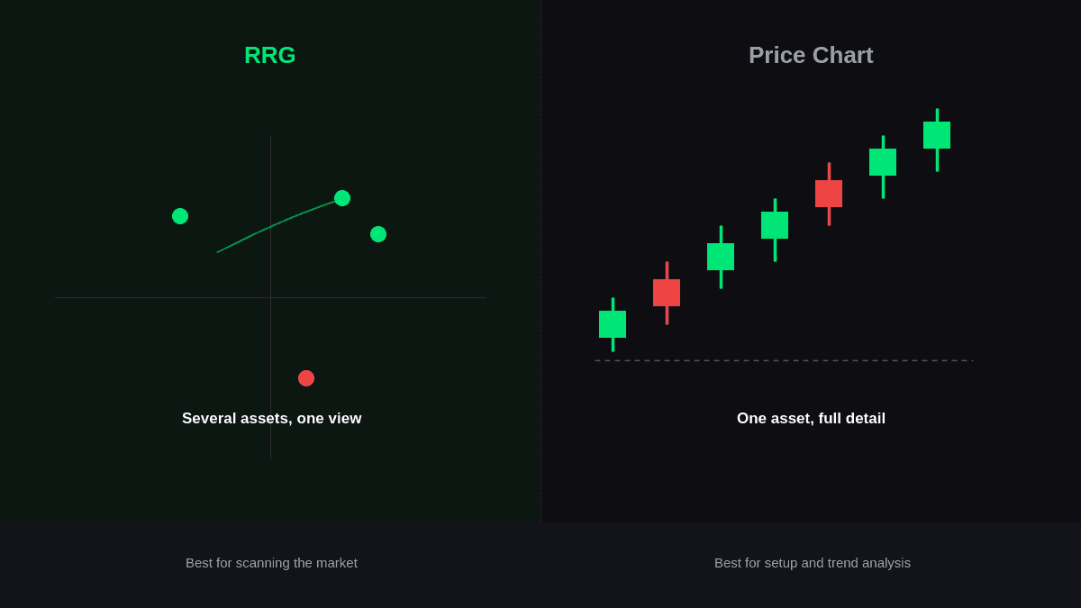
RRG analysis and traditional price charts serve different purposes. RRG helps compare relative strength and momentum, while price charts show an asset’s actual price movement.
| Feature | RRG | Traditional Price Chart |
|---|---|---|
| Main purpose | Compare multiple assets | Study individual price behavior |
| Relative performance | Central focus | Requires separate analysis |
| Momentum comparison | Visual and comparative | Usually requires indicators |
| Multiple assets | Easy to view together | Often requires separate charts |
| Exact price levels | Limited | Detailed |
| Best use | Market scanning | Setup and trend analysis |
Using both tools together can provide a more complete picture. The RRG can help you narrow the field, while the individual chart can help you study the actual setup.
How Beginners Can Build an RRG Analysis Routine
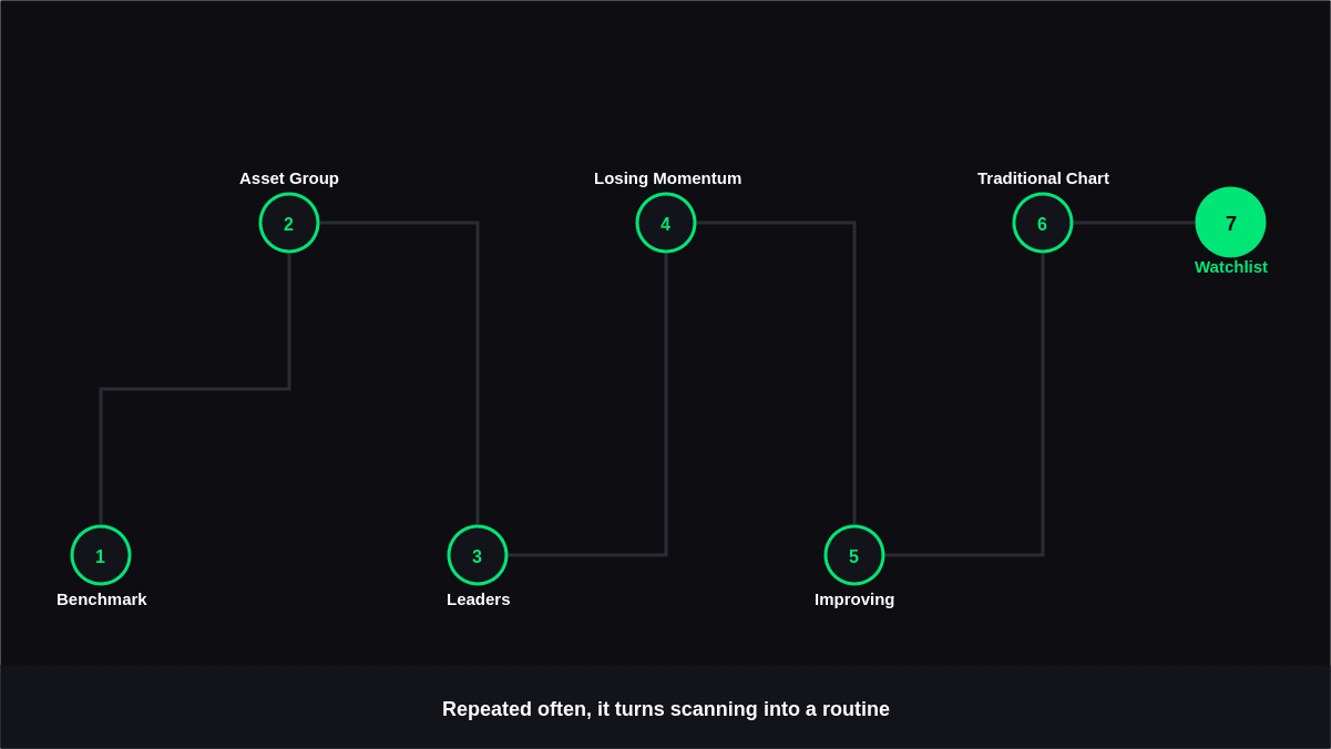
You don't need to constantly watch an RRG to benefit from it.
A simple routine could look like this:
- Select a relevant benchmark.
- Review a logical group of assets.
- Identify current leaders.
- Check which leaders are losing momentum.
- Look for promising movement in the Improving quadrant.
- Investigate the most interesting assets on traditional charts.
- Add confirmed candidates to a watchlist.
Over time, this process can make market scanning more organized and less dependent on checking dozens of individual charts.
Conclusion
Learning how to use a relative rotation graph is less about memorizing four quadrants and more about understanding the relationship between relative strength, momentum, and movement. The chart can quickly show which assets are leading, which are losing momentum, and which may be starting to recover.
The most effective approach is to use an RRG as the first stage of your analysis. Choose a meaningful benchmark, study the quadrant and trail, compare assets with one another, and then confirm interesting findings on traditional price charts. Used this way, an RRG can make market scanning more efficient while helping you focus your research on the assets and sectors undergoing the most meaningful changes in support resistance analysis.